Map Colors Guide: The Importance of Map Color Palettes
Maps have been an indispensable tool for humanity for centuries, aiding in navigation, exploration, and understanding of the world around us. In this vast array of geographical representations, color stands out as a critical element.
It is more than just an aesthetic choice; it is a powerful tool that significantly influences how we perceive and interpret geographical information on maps.
This article delves into the profound importance of map colors in cartography, exploring their strategic use and how they shape our understanding of the world.
By comprehending the science and artistry behind map colors, we can harness their potential to create more informative, intuitive, and visually appealing maps.

Understanding Map Colors
Map colors, meticulously selected and applied, play a pivotal role in conveying diverse information about geographical features.
They serve as a symbolic language that guides us through the complexities of landscapes, providing insights into terrains, bodies of water, vegetation, and man-made structures.
Understanding the significance of each color is paramount in interpreting a map accurately. For instance, shades of blue typically represent water bodies, aiding in identifying rivers, lakes, and oceans.
On the other hand, various shades of green are used to depict vegetation, helping us grasp the extent and types of forests or grasslands in an area.
Therefore, the significance of understanding map colors cannot be overstated; it's the key to unlocking the rich tapestry of information woven into maps.
Types of Map Color Schemes
There are three main color scheme types applied to maps: qualitative, sequential, and diverging, though binary schemes can also be used to visualize differences between two categories.
Variations in hue, saturation, and lightness are also commonly applied to differentiate data. This all sounds pretty confusing now, but the main idea is that your color scheme type changes based on what it is you’re mapping.
Let’s delve a little deeper into each type of color scheme to better understand what this all means.
- Qualitative Schemes: Qualitative color schemes are for distinct categories like race. They use hues to show differences, emphasizing specific categories with darker or saturated colors. This color scheme type is not for ordered numerical data, but rather good for related categories like types of buildings.
- Sequential Schemes: Sequential color schemes are used for ordered data like population density. Lighter colors represent lower values, and darker colors represent higher values. These schemes can use single or multiple hues. More data classes make it harder to distinguish each step.
- Diverging Schemes: Diverging color schemes combine two sequential schemes with a central break point. They diverge from a shared light color, emphasizing mid-ranges in the data. Dark hues represent extremes, and changes in lightness show intermediate values. These schemes are typically symmetrical but can be adjusted based on data distribution. They work well for temperature variations and stock exchange dynamics.
The Significance of Color in Mapmaking
Mapping color palettes aren’t just about aesthetics; they have a profound impact on the readability, interpretation, and effectiveness of a map. Thoughtfully chosen colors can enhance clarity by differentiating between features and conveying information more effectively.
Color choices can aid in categorizing and prioritizing information, guiding the viewer's eye towards critical elements and enhancing the utility of the map. The psychology of color is an essential aspect of map design.
Different colors evoke different emotions and have varying cultural or contextual meanings. For example, red might signify danger in many cultures, while green often represents safety or progress.
Understanding these psychological nuances allows cartographers to use colors strategically to influence how people perceive and interact with maps.
But this notion isn't new by any means. In fact, mapmaking and color have a long, intertwined history.
The History of Mapmaking & Color: The Beginnings
Ranging from aesthetic to symbolic, color has played many roles in the art of mapmaking since its very beginnings.
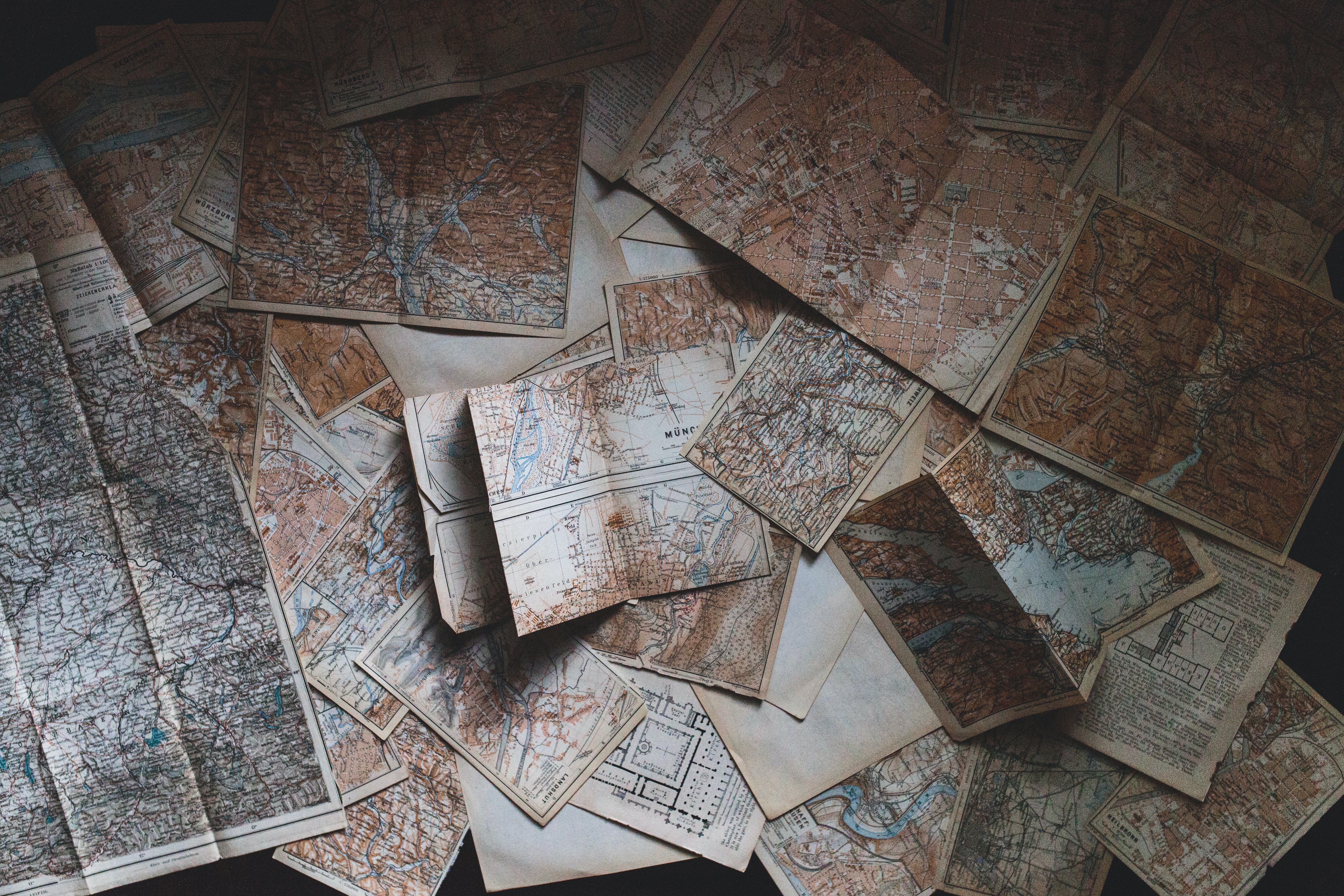
In older maps, color was used as decoration— an embellishment enhancing illustrations or borders, but maps themselves were often left uncolored. Over time, however, color became useful in detailing coastlines and political borders, and eventually became ingrained in maps as we know them now: cartographical illustrations using different colors to distinguish countries, states and bodies of water.
Antique mapmaking saw some limitations in quality and quantity of pigments and dyes available. Though a variety of colorants were employed in maps, the most commonly available dyes produced shades of green, yellow, red, and blue.
It’s no coincidence that our modern maps reflect hues of these same colors, but while the colors themselves have remained somewhat constant, the methods of coloring these maps has changed drastically.
In antiquated maps, color was manually applied through watercolor methods. The outcomes varied from one map to another, relying significantly on the painter's proficiency.
Variations in color were evident due to the quality and durability of the available colorants, even when employing the same one.
Additionally, color alterations occurred over time. In contemporary map production, synthetic colors are employed, ensuring uniformity and long-lasting color stability.
Mapmaking in the Mid-20th Century
Between 1940 and 1960, mapmaking underwent a transformative shift. Traditional drawing paper was substituted with plastic sheets, evolving mapmaking into a primarily photochemical assembly process.
As the 1960s unfolded, cartography transitioned from a pen-and-ink-centered discipline to one primarily reliant on computer technology.
Conventional draftsmen were supplanted by automated machines, leading to a significant increase in map production at reduced expenses while ensuring a consistent and higher graphic quality.
Modern Mapmaking
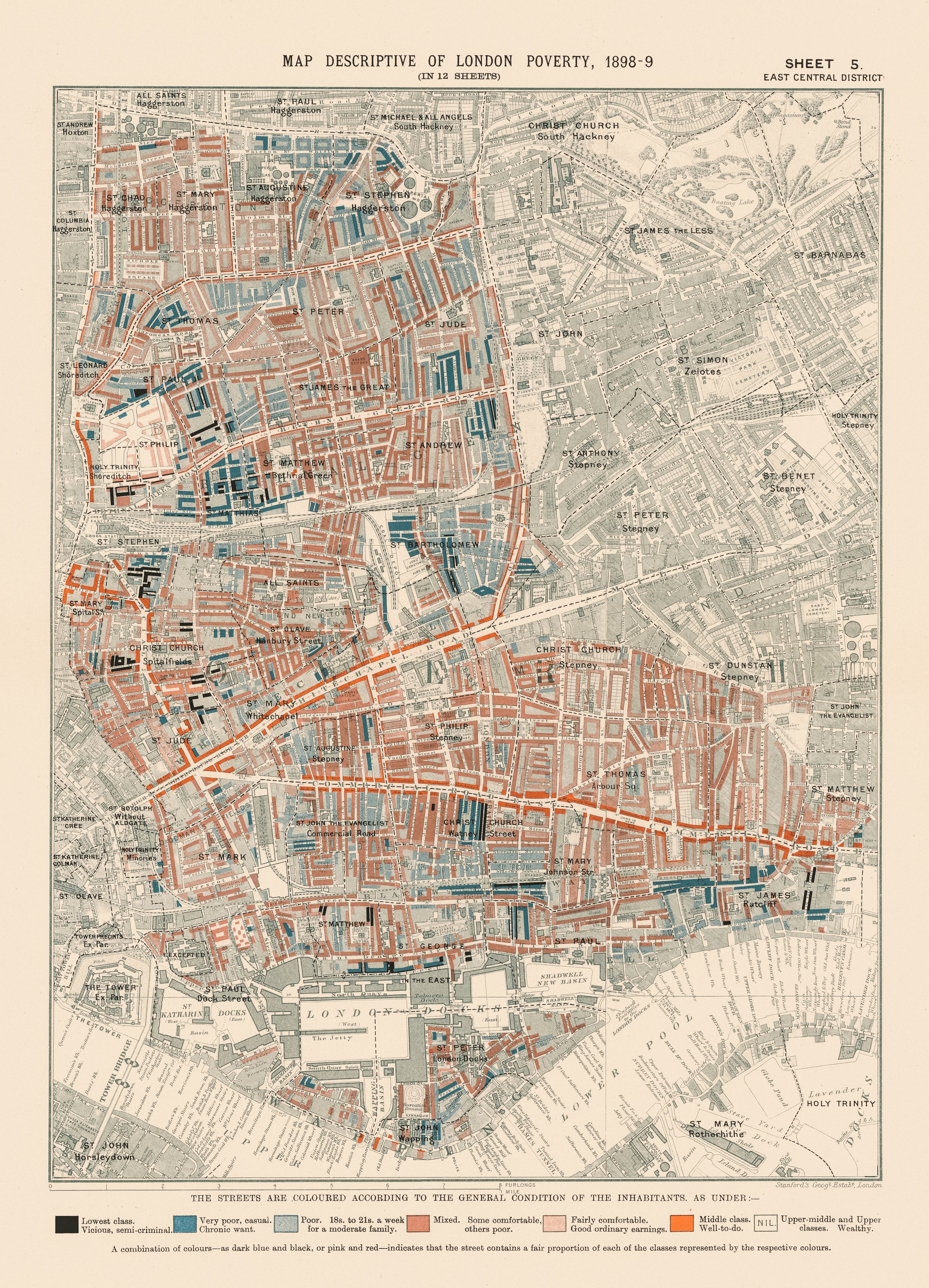
In contemporary mapmaking, mapping color palettes serve as an effective means to convey statistical information.
Each color can symbolize a specific numerical value, such as the population or number of houses in an area, providing a visual representation of population density or housing distribution.
Colors are also utilized to illustrate topographical features, with varying shades indicating elevations above or below sea level. A standardized approach to map coloring has emerged, employing different colors to communicate distinct types of information.
This entails selecting specific hues based on their suitability for depicting nominal or ordinal data. For instance, hues like red, green, and blue may be utilized to represent various soil types (a nominal data type), while yellow, orange, and red might be chosen for highly statistical or ordinal data.
With a comprehensive range of consistent hues and shades at our disposal, maps can convey a wealth of information beyond simple navigation.
The Best Reasons to Color Code a Map
Color coding a map is a powerful technique that serves a multitude of purposes, each contributing to enhancing the map's functionality and user experience.
Firstly, it helps in highlighting and emphasizing specific geographic elements, making the map more intuitive and informative. For example, using a bright color to mark hiking trails on a recreational map immediately draws the viewer's attention to these paths.
Moreover, appropriate mapping color palette usage enhances map clarity, making it easier to navigate and comprehend for users. For instance, using a distinct color for highways as opposed to local roads aids in quick differentiation.
Additionally, colors facilitate data visualization and analysis, aiding in the extraction of meaningful insights from the map's information. A heat map using a gradient of colors, for example, can effectively represent population density.
Traditionally, color in mapmaking has been employed to communicate these data points without the need for words— the red areas on a weather map are understood as hotter than blue ones, and even modern GPS systems like Google Maps and Waze use striking, bold colors to highlight selected routes, sometimes including the use of darker colors to symbolize a traffic jam or a road under construction.
The best reason to color code a map, in essence, is to say something to the reader without using words at all. Whether you want to communicate the existence of a beautiful pond or an important route, using color in your map can help you transmit your messages clearly (and beautifully!).
How Many Colors Are Needed to Color a Map?
The art of selecting mapping color palettes involves a delicate balance between providing enough detail to be informative and maintaining simplicity for clarity.
It's essential to determine the appropriate number of colors to use, keeping in mind the map's purpose and the type of information it conveys.
Using fewer colors to convey more information is a fundamental principle in mapmaking. Too many colors can overwhelm the viewer, diluting the intended message of the map.
Prioritization and categorization of data are crucial in choosing a limited color palette that represents the most critical aspects of the map's purpose.
The goal is to find the perfect equilibrium, ensuring the map remains visually engaging while effectively communicating the intended information to its audience.
The Four Color Theorem
If you want to get mathematical with your map (map-thematical?) coloring, look no further than Guthrie’s Four Color Theorem.
The Four Color Problem traces its origins back to 1852 when Francis Guthrie, while coloring a map of English counties, realized that four colors were enough. Curious about this observation, he asked his brother Frederick if it held true for any map—could every region be colored using four colors in a way that neighboring regions (not just touching at a point, but sharing a common boundary) had different colors?
A year later, Alfred Kempe, another mathematician, presented what was considered a 'proof,' but mathematician Percy Heawood identified its flaw 11 years later. Another unsuccessful proof was put forth by physicist Peter Tait in 1880, with a flaw in the argument identified by Julius Petersen in 1891.
Despite these failed attempts, they contributed valuable concepts. Kempe discovered Kempe chains, and Tait presented an alternative form of the Four Color Theorem using 3-edge-coloring.
A significant advancement came from George David Birkhoff, whose work enabled Phillip Franklin in 1922 to prove the four color conjecture for maps with up to 25 regions. Other mathematicians utilized this work to make progress on the four color problem.
Heinrich Heesch played a crucial role, developing essential elements for the final proof: reducibility and discharging. While the concept of reducibility had been explored by other researchers, the notion of discharging, critical for the unavoidable part of the proof, is attributed to Heesch.
He also conjectured that refining this method could solve the Four Color Problem. This conjecture was indeed proven by Appel and Haken in 1976 when they published their proof of the Four Color Theorem.
In conclusion, there’s actually a lot more to map color palettes than choosing pretty shades and making water blue. What all these mathematicians and scientists proved was that four colors is, in fact, enough to color a map in a way that no two neighboring areas would be the same color.
However, custom maps are an entirely different story. If you don't want to take the mathematical route, you can color your map in any shade or color— or mix of both— you desire.
If your maps aren't meant to convey heavy data and you just want a little souvenir of a trip or important event, focus your color choices on what you want to see on a map. Ultimately, the coloring choice is all yours!
Map Colors in Weather Maps
Weather maps employ a specific and standardized color scheme to communicate weather conditions effectively.
The colors are carefully chosen to represent different weather phenomena, aiding the viewer in quickly understanding the current and forecasted weather at a glance. For instance, shades of blue might represent areas of rain, while red could signify high temperatures.
The color-based system enhances the map's readability and accessibility, enabling individuals to make informed decisions based on the weather information presented. For example, a deep red hue could indicate a heatwave, prompting viewers to take necessary precautions.
These standardized map color palettes have become a universal language in weather mapping, facilitating quick and easy comprehension of complex meteorological data.
Map Colors on Google Maps
Google Maps, one of the most widely used mapping services, employs a thoughtful and intuitive color scheme to convey diverse information.
Roads, a fundamental aspect of maps, are typically highlighted in varying shades of orange and yellow, making them easily distinguishable from other map features.
Parks and densely vegetated areas are depicted in shades of green, providing a clear indication of natural landscapes.
Bodies of water, such as lakes and rivers, are represented in shades of blue.
Understanding and familiarizing oneself with these color conventions are paramount to effectively utilizing Google Maps. This knowledge allows users to navigate and extract information efficiently, enhancing their overall mapping experience.
When you look at a location on Google Maps, you almost feel like you’re viewing the world you exist in from above— and that’s precisely the goal. They want you to identify physical bodies that surround a location, be it greenery or buildings, so that you can navigate an area swiftly and effectively.
Map Colors: Beyond Land Features
Map color palettes extend beyond mere representation of land features; they embody a rich language of their own. Each color serves a unique purpose, aiding in the representation of distinct geographical elements.
For example, brown is often used for contour lines and elevation, providing a visual representation of the topographical features of a landscape. These lines help us visualize the elevation changes in the terrain, crucial information for hikers, geologists, and planners.
By understanding the significance of each color, we unlock a deeper level of understanding when interpreting maps. This, in turn, enhances our ability to glean insights and navigate our world effectively.
- Brown: Typically used for contour lines and elevation, brown provides a visual representation of the topographical features of a landscape. These lines help us visualize the elevation changes in the terrain, essential information for hikers, geologists, and planners.
- Green: The color green is primarily used to depict vegetation. Forests, grasslands, and parks are commonly represented using varying shades of green, providing a clear understanding of the distribution of plant life and ecosystems.
- Blue: Blue is universally recognized as the color of water. It is extensively used to represent oceans, rivers, lakes, and other water bodies on maps. The varying shades of blue help in differentiating between deep and shallow waters, aiding sailors, travelers, and marine researchers.
- Black: Black is used for man-made objects. This includes roads, buildings, and other structures. It provides a stark contrast to natural elements, making it easily distinguishable and helping urban planners, tourists, and anyone navigating an unfamiliar area.
- Red: Typically reserved for transportation and recreational areas, red signifies movement and activity. Roads, highways, airports, and recreational facilities are often marked in red for quick identification. This aids commuters, travelers, and tourists in planning routes and activities.
- Yellow: Yellow is often used for quadrants and boundary lines. It serves as a clear demarcation, outlining regions and boundaries. This is crucial for administrative purposes, helping governments, researchers, and planners define regions and jurisdictions.
Other Map Elements
Apart from colors, several other map elements contribute to the comprehensive language of cartography. Symbols, for instance, represent various features such as landmarks, transportation hubs, and natural formations.
Each symbol carries a specific meaning, aiding in easy identification and navigation. For example, a tiny airplane symbol might indicate an airport, while a small tent icon could represent a camping site. These symbols enrich the map's content, providing a wealth of information at a glance.
Map scales play a pivotal role in measurement and proportion on maps. They guide us in understanding the relative distances and sizes of geographical features.
The proper use of map scales ensures that the map accurately represents the real-world distances, a critical aspect for travelers, engineers, and researchers.
Scales vary based on the map's purpose; a world map would have a different scale compared to a city map. Understanding and interpreting these scales enable us to plan journeys and estimate distances effectively.
Map grids, another vital element, assist in location pinpointing and measurement precision. They divide the map into easily identifiable sections, making it simpler to convey locations and navigate through the map.
Grids are essential for map reading, providing a standardized system to reference specific coordinates, vital for military, emergency responders, and explorers. These grids, often represented by intersecting lines of latitude and longitude, offer a standardized way to pinpoint locations, making maps highly efficient tools for various applications.
A Modern Take on An Old Practice
Although maps have been around for thousands of years, guiding humanity through new and previously uncharted territories, we in the modern day have given them new meaning.
With the development of smartphones, the internet, and the advances in GPS, we may no longer need physical maps to drive across the country or figure out when to get off the highway.
Perhaps all the maps about topography and elevation and country borders are now readily available to us at the tip of our fingers, but that doesn't mean mapmaking has become a practice of the past.
Maps now hold new meanings. They take on a new role, carving a different kind of path— not a path meant to help you get from one point to another, but rather the path to your memories.
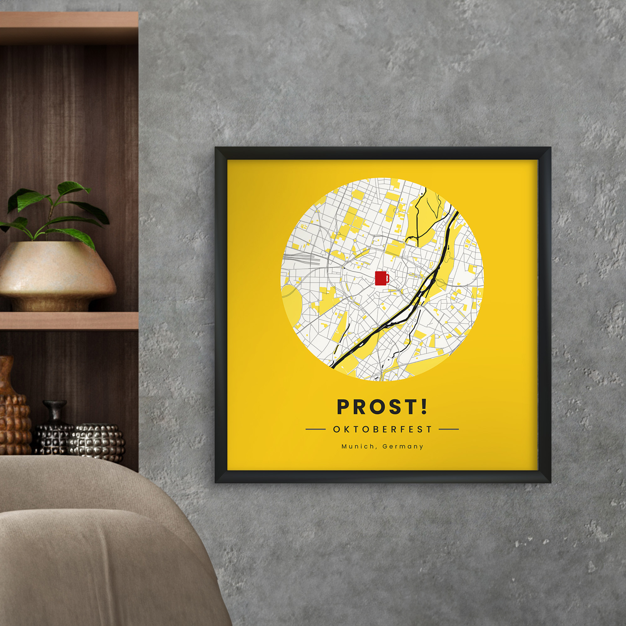
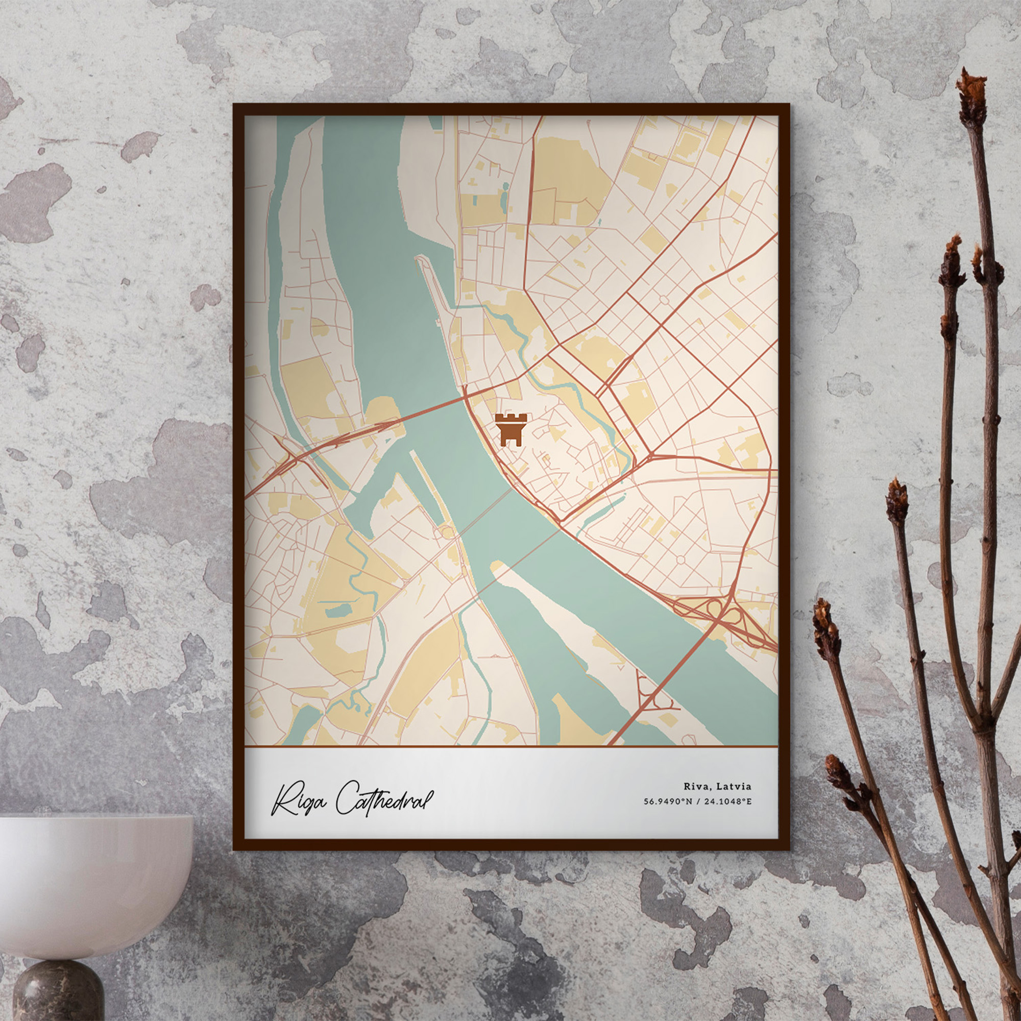
Here at MixPlaces, we specialize in custom mapmaking. Our goal is to help you convert your most cherished, heartfelt memories into works of art to be displayed in the spaces you inhabit.
Perhaps you wish to map the very hospital in which your child took their first breath, or maybe you want to memorialize that street you walked daily while living abroad. You might want to frame your hike up Mount Everest, or that pretty steep hill in your local park.
Whatever you may want to map, we’re here to help you create a one-of-a-kind piece of art made in your image and likeness. And with this map colors guide (plus our mapping color palettes custom-made by professional designers), there’s no way you can go wrong!

The Bottom Line on Map Colors
Map colors are an integral aspect of cartography, deeply influencing how we perceive and interpret geographical information. Their strategic use enhances the visual appeal and functionality of maps, aiding us in efficiently understanding and utilizing them.
By understanding the science and psychology of colors, and how they interact with other map elements, we can create maps that effectively convey information and engage the audience.
Exploring the role of color in mapmaking is an ongoing endeavor, continually evolving with technology and design trends. It is a harmonious blend of art and science, with colors as the vibrant brushstrokes that bring maps to life.
As we venture further into the world of cartography, let's embrace the enduring significance of color in guiding our understanding of the world and continue to innovate and refine the art of map design.
At MixPlaces, we wish to aid you in all your mapping needs, whether you want to recall an exciting trip in a foreign land or commemorate your daily commute right at home.
Create high-quality, museum-grade maps today and leave your artistic mark for generations to come.
Happy mapping!